
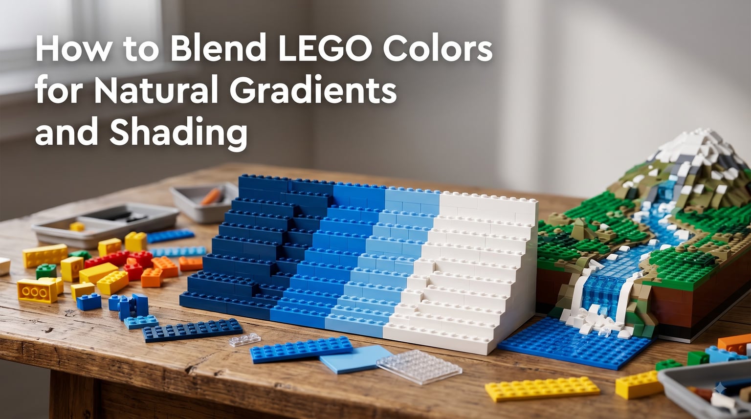
When I look at a MOC that stops me mid-scroll, it almost always comes down to one thing: the color work. The builder understood how to blend LEGO colors for natural gradients and shading, and the result feels alive instead of flat. That technique is what separates a good build from one people remember.
I have spent years experimenting with color transitions in my own MOCs, from castle landscapes to sci-fi terrain. Along the way, I learned that LEGO color blending is not about having every shade ever produced. It is about understanding which colors transition well, how to plan your blend zones, and how to use light and shadow to create depth with a medium that has no actual gradients.
In this guide, I will walk you through everything you need to know. We will cover LEGO color theory, step-by-step gradient creation, shading principles, natural patterns worth recreating, and the mistakes that ruin an otherwise solid build. Whether you are building medieval landscapes, modern architecture, or sculptural MOCs, these techniques will change how you think about color.
Table of Contents
Understanding the LEGO Color Palette
The LEGO system includes over 200 active colors across its entire production history, and that number grows slightly every year. These range from standard primaries like Bright Red and Royal Blue to nuanced shades like Dark Orange, Sand Green, and Medium Azure. Each color has an official LEGO name and a corresponding BrickLink name, and knowing both helps when sourcing parts for specific blends.
Unlike paint or digital art, LEGO colors are discrete. You cannot mix Bright Blue and White on a palette to get Light Blue. Every shade is a fixed, physical piece of plastic, which means your gradients are built from a finite set of stepping stones. This is what makes LEGO color blending both challenging and rewarding. You are creating the illusion of a smooth transition using a limited number of fixed color blocks.
Two properties matter most when planning a blend: saturation and value. Saturation refers to how intense a color looks. A bright, vivid red has high saturation, while a muted dark red has lower saturation. Value describes how light or dark a color is. White has the highest value and black the lowest. When you blend LEGO colors for natural gradients, you are really working with these two properties to guide the eye from one color to another without jarring jumps.
Here is a practical example. If you want a gradient from Dark Blue to White, you need intermediate steps. Light Blue, Medium Azure, and Very Light Bluish Gray all sit between those two anchors in terms of value. The trick is finding colors that step gradually enough that each transition feels natural rather than abrupt.
Color Theory Basics for LEGO Builders
Color theory sounds intimidating, but the core ideas are simple and they directly improve your MOC coloring. Let me break down the concepts that matter most for LEGO builders.
The color wheel is your starting point. It arranges colors in a circle based on their hue relationships, with primary colors (red, blue, yellow) spaced evenly and secondary and tertiary colors filling the gaps. For LEGO purposes, think of the wheel as a map of which colors sit near each other and which sit across from each other.
Complementary vs Analogous Colors
Complementary colors sit opposite each other on the color wheel. Red and green, blue and orange, yellow and purple are all complementary pairs. These colors create maximum contrast and visual energy when placed next to each other. They are excellent for focal points and eye-catching details, but they are terrible for smooth gradients. Placing red directly next to green creates a visual vibration that breaks any illusion of a natural transition.
Analogous colors sit next to each other on the wheel. Blue and turquoise, orange and yellow, red and orange are analogous pairs. These colors share similar undertones, which means they blend naturally. When you are building gradients, analogous colors are your best friends. They move smoothly from one to the next because they already share a visual family connection.
The 60-30-10 Rule for MOC Color Composition
Borrowed from interior design and painting, the 60-30-10 rule gives your builds a balanced color foundation. The idea is that 60 percent of your MOC uses one dominant color, 30 percent uses a secondary color, and 10 percent uses an accent color. This keeps your builds looking intentional rather than chaotic.
I apply this to nearly every MOC I build. For a forest scene, my dominant 60 percent might be dark green, the secondary 30 percent a mix of medium green and olive green for gradients, and the 10 percent accent a pop of bright orange or red for flowers or a striking detail. The gradient work happens in that 30 percent zone, where analogous colors transition into and out of the dominant shade.
For color blending specifically, the rule also helps you avoid the number one complaint I see on Reddit LEGO MOC forums: builds that look muddy or chaotic from using too many colors. Stick to a tight palette and use your intermediate shades for transitions, not for adding new colors.
Which Colors Blend Well Together
Through testing and community feedback, certain color families consistently produce smooth, natural gradients in LEGO builds:
Blue family: Dark Blue to Medium Blue to Light Blue to Very Light Bluish Gray to White. This is the classic sky gradient and one of the most reliable blends in LEGO.
Green family: Dark Green to Green to Bright Light Green to Lime to Yellow. Perfect for foliage transitions and organic textures.
Earth tones: Dark Brown to Reddish Brown to Dark Orange to Medium Nougat to Tan to Light Bluish Gray. Ideal for terrain, rocks, and natural landscapes.
Gray family: Dark Bluish Gray to Light Bluish Gray to Very Light Bluish Gray to White. The backbone of architecture and sci-fi builds.
Warm sunset: Dark Red to Reddish Brown to Dark Orange to Bright Light Orange to Yellow. Creates dramatic fire and sunset effects.
How to Blend LEGO Colors for Natural Gradients
This is the core of what most builders struggle with, and it is the question I see asked most often in LEGO MOC communities. Here is my step-by-step process for creating smooth, natural-looking color gradients in any build.
Step 1: Choose your two anchor colors. Every gradient starts with a beginning and an end color. These are your anchors, and they define the range of your blend. Pick colors that share a visual connection, meaning they should be analogous or part of the same color family. Dark Blue to White works. Dark Blue to Bright Pink does not, unless you are going for a stylized effect.
Step 2: Identify available intermediate colors. Look at the LEGO color palette and find every shade that sits between your two anchors in terms of value and saturation. For a Dark Blue to White gradient, your intermediates might include Medium Blue, Light Blue, and Very Light Bluish Gray. Write these down or lay out physical bricks in a line from darkest to lightest.
Step 3: Plan your transition zone. Decide where the gradient will happen in your build and how much physical space it covers. A wider transition zone allows for more intermediate colors and a smoother blend. A narrow zone forces sharper transitions. As a rule of thumb, I allocate at least 4 to 6 rows of height or depth for a convincing gradient. Anything less than 3 rows will look like a hard line.
Step 4: Build using the overlap technique. Instead of placing all of one color in a block and then switching abruptly to the next color, interleave them at the boundary. In the transition rows, alternate between two neighboring colors, gradually shifting the ratio. Start with 80 percent of the darker color and 20 percent of the next shade. Then move to 60/40, then 40/60, then 20/80 before transitioning fully. This creates a visual blend that mimics how paint merges on a canvas.
Step 5: Break up the pattern. Pure, regular gradients can look mechanical. Nature is irregular. Add scattered bricks of intermediate colors slightly outside the main transition zone. Place a few lighter bricks in the darker section and vice versa. This randomness is what makes a gradient feel organic rather than computed.
Step 6: Step back and evaluate. View your build from the intended viewing distance. Gradients that look rough up close often read as smooth from two or three feet away. If a transition still looks harsh, add another intermediate color or widen the overlap zone.
I cannot stress Step 4 enough. The overlap technique is the single most effective way to blend LEGO colors naturally. It is the LEGO equivalent of a painter feathering edges between two colors. Without it, your gradient is just a series of stacked color bands.
Light Source and Shading Principles
No competitor I found covers this topic, and it is arguably the most powerful technique for creating realistic shading in LEGO MOCs. Understanding how to simulate light direction with color transforms a flat wall into a three-dimensional surface.
Every real-world object has a light source, and that light source determines where highlights and shadows fall. In LEGO, you simulate this by placing lighter colors where light would hit and darker colors where shadows would form. The key is consistency. Pick a light direction and commit to it across your entire build.
Establishing Your Light Direction
Before you place a single brick, decide where your imaginary light comes from. Most builders choose upper left or upper right, mimicking how natural sunlight hits objects. Once chosen, every shading decision follows that direction. The top and the side facing the light get lighter colors. The bottom and the side facing away get darker shades.
For a simple wall, this might mean using Light Bluish Gray on the top-left portion, Medium Bluish Gray in the center, and Dark Bluish Gray on the bottom-right. The result is a wall that looks like it is catching light, even though every brick is the same physical material.
Warm and Cool Shading
Light has a temperature, and you can simulate this with LEGO colors. Warm light sources, like fire, sunset, or indoor lamps, cast warm highlights. Use colors with yellow, orange, or red undertones for lit areas. Cool light sources, like moonlight or overcast sky, cast cool highlights. Use colors with blue or gray undertones.
Shadows work the opposite way. Warm light creates cool shadows, so darken shaded areas with blue-gray or purple-tinged colors. Cool light creates warmer shadows, so use brown or dark gray tones. This temperature contrast between light and shadow is what makes builds feel cinematic and realistic.
Shadow Placement
Shadows are not just about darkness. They follow rules based on the shapes casting them. An overhang casts a shadow directly below it. A column casts a shadow on the ground opposite the light source. A rounded surface has a gradient shadow that transitions smoothly from light to dark across its curve.
For rounded surfaces like towers or domes, use a vertical gradient. Place the lightest color at the top where light hits hardest, then transition through two or three progressively darker shades down the sides. The darkest shadow sits at the bottom or on the side facing away from your light direction. This technique alone will make your cylindrical builds look dramatically more realistic.
Natural Gradient Patterns to Recreate
Nature provides the best reference for color gradients, and recreating natural phenomena in LEGO is one of the most satisfying challenges in MOC building. Here are the most common natural gradient patterns and the LEGO colors that make them work.
Sky Gradients
A clear sky transitions from deep blue at the zenith to pale blue to nearly white at the horizon. To recreate this, build upward using Dark Blue at the top, Medium Blue in the middle, Light Blue lower down, and Very Light Bluish Gray or White near the ground line. The transition should be gradual, spanning at least 8 to 10 rows for a convincing sky.
For a sunset sky, the gradient shifts from Dark Blue at the top through Purple and Dark Pink to Bright Light Orange and Yellow near the horizon. This is one of the most dramatic gradients you can build, and the overlap technique is essential because the color jumps between blue and orange families are large.
Water Gradients
Deep water transitions from dark at the depths to light at the surface or shoreline. Start with Dark Blue at the bottom, transition through Medium Blue and Light Blue, and finish with Transparent Light Blue or Very Light Bluish Gray at the shallow edge. Adding transparent pieces at the surface layer creates a realistic water effect that catches actual light.
For flowing water like rivers or waterfalls, add white or very light blue foam accents using 1×1 round plates or cheese slopes. These scattered light elements break up the gradient and add movement.
Foliage and Terrain
Natural terrain is rarely one flat color. A hillside transitions from dark, rich soil at the base through browns and tans to green grass at the top. Build this using Dark Brown or Reddish Brown at the bottom, Tan or Dark Orange in the middle, and Dark Green to Bright Green at the surface. Adding scattered Olive Green and Dark Orange pieces in the green zone creates the look of earth showing through grass.
For tree canopies, blend Dark Green, Green, Bright Light Green, and Lime in an organic scatter pattern. The key is to avoid clean lines between colors. Mix the shades freely, clustering lighter colors where sunlight would hit the upper branches and darker colors on the undersides.
Skin Tone Gradients
For minifig-scale sculptures or large character MOCs, skin tone blending adds realism to faces and hands. LEGO offers several skin tone shades including Light Nougat, Nougat, Medium Nougat, Dark Nougat, and Reddish Brown. Blend between these at transition zones like jawlines, hands, and areas where light and shadow meet.
The overlap technique is especially important here because skin tone transitions are subtle. Use a higher ratio of the dominant color at each step, with only scattered bricks of the next shade, to keep the transition gentle.
Metal and Weathering Effects
Metal surfaces benefit from value gradients that simulate reflection. Use Pearl Gold, Pearl Dark Gray, or Metallic Silver tones with darker shades in shadow areas. For weathered or rusty metal, blend Metallic Silver or Flat Silver with Orange, Dark Orange, and Reddish Brown at the edges to simulate corrosion spreading inward.
Greebling, the technique of adding small technical details to surfaces, also benefits from color blending. Use multiple shades of gray within your greebled area rather than a single color. This adds depth and makes the mechanical details look like they serve different functions, even if they are purely decorative.
Common Color Blending Mistakes to Avoid
I have made every one of these mistakes, and I see them constantly in LEGO MOC communities on Reddit. Recognizing them early will save you from rebuilding entire sections.
Using too many transition colors. More intermediate shades do not always mean a smoother gradient. If you cram six colors into a four-row transition, the result looks noisy and confused. Stick to three or four well-chosen intermediate shades and use the overlap technique to smooth the transitions between them.
Forgetting viewing distance. A gradient that looks perfect from six inches away might look like a mess from across the room. Conversely, a gradient that feels too subtle up close might read beautifully at display distance. Always evaluate your color work from the distance people will actually view the finished MOC.
Ignoring the 60-30-10 rule. When builders get excited about gradients, they sometimes forget about overall composition. A perfectly blended gradient still looks wrong if it competes with five other color elements in the same build. Keep your dominant color dominant and use gradients within the secondary and accent zones.
Rushing the transition zone. The overlap technique takes patience. If you place color A, then immediately switch to color B with no interleaving, you get a hard line regardless of how close the two colors are. Take the time to feather the boundary with mixed rows.
Using complementary colors for gradients. Red to green, blue to orange, or yellow to purple transitions rarely look natural without intermediate colors that bridge the hue gap. If you must blend across complementary colors, include neutral tones like gray or tan in the transition zone to break up the visual clash.
Digital Design Tips for Color Blending
BrickLink Studio and LDraw are powerful tools for planning color work before you commit physical pieces. I use Studio for nearly every MOC because it lets me test color combinations quickly and check part availability in specific colors.
When designing digitally, use the color picker to lay out your gradient as a flat strip first. Build a simple 1×10 or 1×20 row of plates in your chosen gradient colors and evaluate the transition. This takes minutes and saves hours of rebuilding. If the transition looks harsh on screen, it will look harsh in physical bricks.
One advantage of digital design is the ability to check color availability instantly. Some LEGO colors exist only in a limited number of part types, which can constrain your gradient plans. Studio highlights unavailable part-color combinations, so you know before you start sourcing parts whether your planned gradient is actually buildable.
Keep in mind that digital colors and physical colors can differ slightly. Screen calibration, plastic finish, and lighting conditions all affect how a color appears. A gradient that looks perfect on your monitor might need adjustment once built in real bricks. Always do a physical test strip with actual parts before committing to a large gradient section.
FAQs
What is the 60 30 10 rule for LEGO building?
The 60-30-10 rule means 60 percent of your MOC uses one dominant color, 30 percent uses a secondary color for gradients and variation, and 10 percent uses an accent color for details and focal points. This keeps color compositions balanced and prevents builds from looking chaotic or muddy.
How do you blend a gradient with LEGO bricks?
To blend a LEGO gradient, choose two anchor colors, identify 3-4 intermediate shades between them, plan a transition zone of at least 4-6 rows, and use the overlap technique. Alternate between neighboring colors in ratios shifting from 80/20 to 60/40 to 40/60 to 20/80. Add scattered bricks outside the main zone for organic randomness.
What two colors do not go well together in LEGO?
Complementary colors placed directly next to each other create visual tension. Red next to green, blue next to orange, and yellow next to purple can look jarring without intermediate transition colors. These pairs work for contrast and focal points but are poor choices for smooth gradients unless bridged with neutral tones.
What two colors blend well together in LEGO MOCs?
Analogous colors, which sit next to each other on the color wheel, blend the most naturally. Dark Blue and Medium Blue, Green and Lime, Reddish Brown and Dark Orange, and Light Bluish Gray and White are all excellent blending pairs because they share similar undertones and create smooth visual transitions.
How many LEGO colors are available for blending?
LEGO has produced over 200 colors throughout its history, with roughly 130 to 140 active at any given time. Not all colors are available in all part types, which is why checking availability in BrickLink Studio before planning a gradient is essential. Common colors like grays, blues, and earth tones offer the widest part selection for blending work.
Putting It All Together
Learning how to blend LEGO colors for natural gradients and shading is a skill that compounds with every build. The first time you nail a smooth sky gradient or create depth with directional shading, you will never look at color the same way again. Start with simple two-color transitions, master the overlap technique, and gradually take on more ambitious gradients.
Remember the fundamentals. Choose analogous colors for your transitions. Plan transition zones of at least 4 to 6 rows. Use the overlap technique to feather boundaries between shades. Pick a light direction and commit to it. And always evaluate your work from the distance people will actually view it.
Most importantly, experiment. Pull out your spare parts and build test strips. Try color combinations that seem unusual. The LEGO color palette is deep enough to surprise you, and some of the best gradients I have built came from happy accidents at the parts bin. Grab some bricks, lay out a gradient, and see what you can create.