
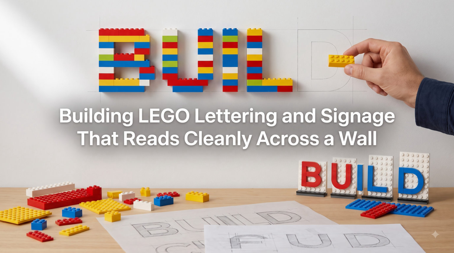
When I built my first LEGO sign for my son’s bedroom wall, I thought bigger letters meant easier reading. The opposite happened. The bulky bricks created shadows that swallowed the curves of the letters, and from across the room the whole thing looked like a smudged rectangle. I rebuilt it three times before it actually worked. That trial-and-error taught me that building LEGO lettering and signage that reads cleanly across a wall is less about size and more about the right pieces, the right spacing, and the right mounting method.
In this guide, I will walk you through everything our team has learned from dozens of wall projects, classroom labels, and MOC builds. You will discover which LEGO pieces give you crisp letterforms, the 5/2 rule that graphic designers swear by for pixel-based letters, and how to attach the finished letters so they stay put for years. Whether you are a parent decorating a playroom or a MOC builder crafting a city facade, this is the playbook we wish we had on day one.
Table of Contents
Why Readable LEGO Signage Matters for Wall Displays
LEGO lettering is a functional element first, decorative second. The minute you mount a sign on a wall, your viewer is reading it from a distance, often at an angle, and usually under uneven lighting. A letter that looks crisp on a table can turn into a visual mess from 12 feet away.
The challenge becomes clear when you think about scale. A 1×1 tile is roughly 8mm wide. At normal reading distance, a single 1×1 represents one “pixel” of your letter. To make a letter that is readable from across a room, you need roughly five pixels of stroke width and proper kerning between letters. That is where the 5/2 rule comes in, and we will cover it in detail later.
Wall-mounted LEGO signage shows up everywhere once you start looking. Teachers label reading corners and STEM stations. Parents spell out names above beds. Small business owners create storefront logos. MOC builders add shop names to modular buildings. In every case, the goal is the same: the letters must announce themselves at a glance. If the viewer has to walk closer to decipher them, the signage has failed.
Essential LEGO Pieces for Building Lettering
The pieces you choose will make or break the readability of your lettering. I have grouped them by purpose so you can grab the right mix before you start building.
Standard Tiles for Smooth Letter Surfaces
Tiles are flat, studless pieces that give your letters a clean, professional finish. They sit flush against each other with no protruding studs, which is exactly what you want for readable lettering. The 1×2 tile and 1×1 tile are your workhorses. Most letter shapes can be built entirely from these two sizes.
For block-style letters like in a hospital sign or a comic book logo, tiles are non-negotiable. Studs catch light and cast shadows that break up your letter shapes. Always use tiles, never plates with exposed studs, on the face of your letters.
Curved Tiles for Smooth Letter Edges
Curved tiles changed the lettering game when LEGO released them more broadly. The 1×1 quarter circle round tile and 1×1 half circle round tile let you soften corners on letters like O, C, S, and G. They come in limited colors, mostly white, black, and a few earth tones, but they are worth sourcing.
Chris McVeigh’s designs have become famous for using curved tiles to create symbols like treble clefs and musical notes. His work shows that the right tile choice makes lettering feel intentional rather than improvised. If you want polished lettering, curved tiles are worth the BrickLink hunt.
Macaroni Round Corner Tiles
The 2×2 macaroni round corner tile is a specialty piece with two adjacent rounded corners. It is perfect for the rounded corners of block letters or for finishing off edges on signage. These are less common in classroom brick collections, so plan to order from a parts supplier if your design calls for them.
Plates and Bricks for Body and Mounting
Beneath the visible letter face, you will use plates and bricks to give the lettering depth and a place to attach mounting hardware. Plates (1×2, 2×4, 2×6) work well for thin signs. Bricks add 3D depth that looks great on shelves but can feel heavy on a wall.
For wall-mounted signs, I recommend keeping the backer plate simple. A flat plate base lets the sign sit closer to the wall and reduces the leverage that pulls adhesive loose over time. Less depth means less strain on your mounting method.
SNOT Bricks for Studs-Not-On-Top Construction
SNOT (Studs Not On Top) bricks have studs on their sides. They let you build outward from a flat baseplate rather than only upward. For signage that reads cleanly, SNOT bricks open up possibilities for attaching mounting plates to the back of your lettering without disrupting the visible face.
The 5/2 Rule Explained: The Secret to Clean Pixel Letters
The 5/2 rule is the single most useful guideline I have found for LEGO lettering. It comes from pixel art and graphic design, and it solves the most common lettering problem: letters that look chunky, distorted, or hard to read.
Here is the rule: for every 5 pixels of horizontal stroke in your letter, you should have roughly 2 pixels of vertical thickness. In other words, the width of a stroke should be about 2.5 times its height. This ratio mimics the proportions of professional fonts and prevents letters from looking too thin or too bulky.
Let me show you with an example. Take the letter “E.” A common mistake is making all the strokes 1 pixel wide on a 5-pixel-tall letter. The result looks cramped and amateurish. Apply the 5/2 rule instead: make the vertical stem 2 pixels wide and the horizontal arms 2 pixels thick, leaving 2 pixels of height above and below the middle arm. Suddenly the letter looks balanced and clean.
The same rule applies to letter spacing. Two adjacent letters should be separated by at least 1 pixel of empty space, ideally 2 pixels for body text. Letters that touch each other become a single shape from across the room. Letters with too much space look like they are drifting apart.
Reddit graphic designers have pointed out another related trick: removing corner pixels on letters like “L” and “T” produces a cleaner, more typographic look. The corner pixel adds nothing to legibility and creates a blocky, childish appearance. Cut it, and your letters suddenly look like they came from a real font.
Step-by-Step Process for Building LEGO Letters That Read Clearly
Follow these steps in order. Skipping ahead is how most lettering projects end up on the rebuild pile.
Step 1: Sketch Your Letters on Graph Paper First
Before touching a brick, draw your letters on grid paper. Each square represents one 1×1 tile. This is where the 5/2 rule gets applied on paper. Sketch a few versions, then choose the one that looks most balanced from 6 feet away. Yes, prop the paper on the other side of the room and squint at it. If you can read it at that distance, you have a winner.
Step 2: Choose Your Scale Based on Viewing Distance
For letters read from across a classroom (around 20 feet), each letter should be at least 5 pixels tall, preferably 7. For bedroom names read from the doorway (8 to 10 feet), 5 pixels tall usually works. For small desk signs read from a seated position, 3 pixels tall is the minimum.
I keep a chart taped inside my brick cabinet: viewing distance on one axis, letter height in pixels on the other. It saves me from rebuilding the same sign twice.
Step 3: Build Each Letter One at a Time on a Baseplate
Lay a flat baseplate on your work surface. Build each letter directly on the baseplate, using the grid lines to keep your pixels aligned. Build all your letters in a row with proper spacing before lifting anything off the baseplate.
This approach lets you check kerning between letters as you go. Letters like “A” and “V” need more space between them than “L” and “I.” Build the whole word, then adjust spacing before you commit.
Step 4: Add a Solid Background Plate
Once your letters are laid out, build a background plate around them in a contrasting color. The background defines the shape of each letter from a distance. Without contrast, even well-built letters blur into a single mass.
A 1-stud border around the entire word looks intentional and clean. Make sure the border is the same color throughout. Mixed colors in the border pull attention away from the letters themselves.
Step 5: Test Readability Before Wall Mounting
Hold your finished sign at the wall where it will hang. Walk to the expected viewing position. Can you read every letter without hesitation? If not, identify the problem letter and rebuild it. Common fixes include adding a missing pixel, thickening a thin stroke, or widening the gap between two letters that run together.
Step 6: Attach Mounting Hardware to the Back
Flip the sign over and add SNOT bricks or Technic plates to the back for mounting. We will cover the actual wall attachment methods in the next major section, but plan your mounting points during this step so the sign sits flush against the wall.
Choosing Colors and Contrast for Wall-Viewing Distance
Color choice is half the readability battle. The best-built letters in the world will fail if they blend into their background or fade under typical room lighting.
The rule of thumb is simple: high contrast between letters and background, low contrast within the lettering itself. White letters on a navy background pop from across the room. Yellow letters on a white wall disappear. Pick two colors with strong contrast, then commit.
Classic high-contrast combinations that work well: black on white, white on black, white on navy, black on yellow, yellow on black, white on dark green, and white on dark red. These combinations pass the readability test in any lighting condition.
Avoid color combinations that confuse the eye: red on green (Christmas confusion), light yellow on white (not enough contrast), and any combination where both colors have similar brightness. Brightness contrast matters more than hue contrast for distance reading.
Curved tiles come in fewer colors than standard tiles, and this can limit your options. If your design requires rounded edges, white or black curved tiles paired with a colored background plate usually works. You can also use regular tiles with strategic snipping of corner studs (only on pieces you are willing to modify permanently) to fake the curved look in any color.
Wall Mounting Methods for LEGO Lettering and Signage
How you attach your LEGO letters to the wall is just as important as how you build them. A sign that falls off the wall is a failure no matter how beautiful it looked on the baseplate.
Method 1: Command Strips for Lightweight Signs
3M Command Strips work well for small signs under about 1 pound. Attach the strips to the back of your LEGO build using smooth SNOT bricks or flat plates. Press firmly for 30 seconds when mounting, then wait an hour before loading the sign. Command Strips are removable, which makes them ideal for rental properties or signs you plan to swap out seasonally.
Method 2: 3M Dual Lock for Reusable Heavy-Duty Mounting
Dual Lock is the velcro-style heavy-duty version of Command Strips. It holds significantly more weight and can be opened and closed hundreds of times. This is my go-to for classroom signs that need to be moved between lessons. Press Dual Lock pieces onto the back of the LEGO sign and matching pieces onto the wall. Snap them together for a secure mount.
Method 3: Mounting Plates with Picture Hangers
For large signs over 2 pounds, build a mounting plate into the back of the sign itself. Use Technic bricks with axle holes, or build in two D-ring picture hangers. Drive a nail or screw into the wall, then hang the sign. This method is permanent but very secure.
Method 4: LEGO Baseplate Mounted to the Wall
Mount a green or gray LEGO baseplate directly to the wall using screws or strong adhesive. Then build your letters on the baseplate. This gives you the freedom to swap out letters or rearrange the sign whenever you want. It is the most flexible approach for evolving displays like classroom word walls or store signage.
Method 5: Built-in LEGO Mounting Bracket
For signs that need to project from the wall at an angle (like above a door), build a Technic bracket that connects the sign to the wall mount. This adds complexity but lets you create dramatic floating-letter effects.
No matter which method you choose, always test the mount with the sign fully loaded before you trust it. Give it a firm shake. Tug downward. If anything shifts, reinforce before walking away.
Common Mistakes to Avoid When Building LEGO Wall Signage
I have made every one of these mistakes, often more than once. Learn from my rebuilds.
Mistake 1: Using Plates with Exposed Studs
Studs on the face of your letters create tiny shadows that distort letter shapes from across the room. Always use tiles on the visible face. Plates belong only on the back or sides of your sign.
Mistake 2: Brick Bending to Force Pieces Together
Brick bending, applying force to seat a piece that does not fit naturally, is widely discouraged in the LEGO community. It stresses the plastic, weakens the connection over time, and creates gaps that ruin the look of your lettering. If a piece does not fit, you have the wrong piece. Find the correct one or redesign the letter.
Mistake 3: Letters Too Small for the Viewing Distance
A 3-pixel-tall letter might look great on your desk but vanish from across the room. Always measure your viewing distance and scale your letters accordingly. When in doubt, go one pixel taller than you think you need.
Mistake 4: Mixing Tile Types Without a Plan
Mixing 1×1 round tiles with 1×1 square tiles in the same letter creates an inconsistent surface that catches light unevenly. Pick one tile family for each letter and stick with it.
Mistake 5: Ignoring the Background Plate
Letters without a contrasting background plate lose definition from a distance. The background plate is not optional. It is what gives your letters their shape when viewed from far away.
Mistake 6: Skipping the Test Mount
Building a beautiful sign and then hanging it with the wrong adhesive is heartbreaking when it falls. Always test your mounting method with a fully loaded sign before committing.
Mistake 7: Forgetting About Lighting
A sign that reads perfectly in your well-lit workshop can disappear in the dim corner of a hallway. Look at your wall location at different times of day. If the lighting changes, choose a high-contrast color combination that survives any condition.
FAQs
What is the 5/2 rule in Lego?
The 5/2 rule in LEGO lettering means that for every 5 pixels of horizontal stroke length in your letter, the stroke should be about 2 pixels thick. This ratio mimics professional fonts and produces letters that look balanced and readable from a distance. Graphic designers recommend it because it prevents letters from looking too thin or too blocky when built from square tiles.
How do you build LEGO letters that read clearly from across a room?
Use tiles instead of plates for a smooth face, follow the 5/2 rule for stroke proportions, give each letter at least 5 pixels of height, leave 1 to 2 pixels of empty space between letters, and place your letters on a high-contrast background plate. Always test readability from your actual viewing distance before mounting the sign on the wall.
How do you attach LEGO to a wall securely?
For lightweight signs under 1 pound, use 3M Command Strips on the back of the build. For heavier signs or signs you want to move often, use 3M Dual Lock velcro-style fasteners. For permanent large signs, build a mounting bracket into the back and use screws or nails. For flexible displays, mount a LEGO baseplate directly to the wall with screws and build your letters on top.
Why is brick bending considered a bad practice in LEGO building?
Brick bending means forcing a piece to seat by applying sideways pressure when it does not fit naturally. It stresses the ABS plastic, weakens clutch power over time, creates visible gaps between pieces, and can crack elements. The LEGO community discourages it because proper building should never require forcing. If a piece does not fit, the design or piece choice needs adjusting instead.
Final Thoughts on Building LEGO Lettering and Signage
Building LEGO lettering and signage that reads cleanly across a wall is a skill that gets easier with every sign you build. The pieces become familiar, the 5/2 rule becomes second nature, and your eye for color contrast sharpens with practice. Start with a small name plaque for a child’s bedroom. Move up to a classroom word wall. Eventually you will be designing storefront signage for your modular buildings.
Remember the three things that matter most: tile faces for smooth letterforms, the 5/2 rule for balanced proportions, and high contrast between your letters and their background. Get those right, and your signs will read clearly from anywhere in the room. Get them wrong, and no amount of tile choice will save the build.
Grab your baseplate, sketch your letters on graph paper, and start building. The wall is waiting.