
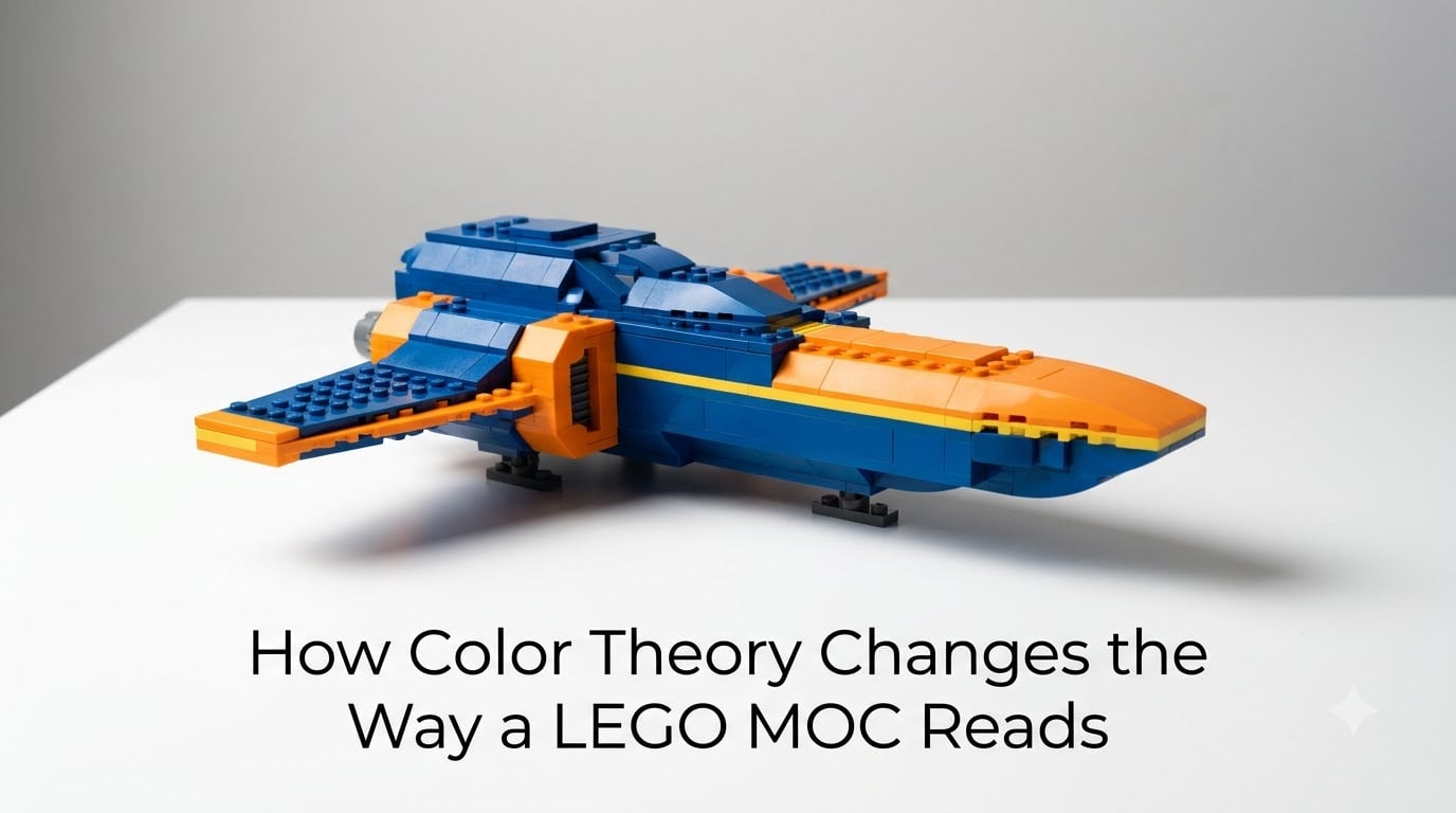
I rebuilt a friend’s spaceship MOC last year using the same parts list, same technique, same silhouette. The only thing I changed was the color palette. Two experienced builders looked at it and assumed I had redesigned half the build. That moment taught me how color theory changes the way a LEGO MOC reads, often more than shape or technique ever could.
Color is the first thing the eye locks onto in any LEGO MOC. Before the brain registers greebles, SNOT work, or part selection, it scans color blocks and decides what the model “means.” A black-and-red starship reads aggressive. A sand-and-sky blue plane reads calm. If your MOC is not communicating what you want, color theory is usually the missing piece, not the brick layout.
In this guide, I will walk you through the color theory principles that actually matter for MOC builders. We will cover the color wheel, color blocking, complementary, analogous, and triadic schemes, and how each one changes readability. I will also share practical tips for working within the LEGO color palette, including the quirky rules around naming and rarity. By the end, you will know how to pick a color scheme that makes your MOC read exactly the way you intend.
Table of Contents
Color Wheel Basics Every MOC Builder Should Know
The color wheel is the foundation of all color theory, and it is the first tool I check whenever I plan a new LEGO MOC. The wheel arranges colors in a circle so that relationships between them are easy to see at a glance.
Primary colors are red, blue, and yellow. You cannot mix them from other colors, and every other color on the wheel starts here. In LEGO bricks, you will know these as Bright Red, Blue, and Yellow.
Secondary colors are made by mixing two primaries. Orange comes from red and yellow, green from blue and yellow, and purple from red and blue. LEGO calls these colors Orange, Green, and Bright Purple. These six colors sit evenly around the color wheel and form the basic reference points for every scheme we will discuss.
Tertiary colors are the in-between shades, like red-orange, yellow-green, and blue-purple. These give a MOC depth and realism. LEGO offers several tertiary shades such as Dark Orange, Lime, and Medium Lavender. When you understand how the three levels of the color wheel relate, choosing a palette becomes far less guesswork.
Color Blocking: The First Step to Readable LEGO MOCs
Color blocking is the technique of grouping bricks by color into clear, solid regions. It is the single biggest readability lever you have in LEGO building. When colors are blocked cleanly, the eye instantly understands where one shape ends and another begins.
Imagine two identical castle walls. One uses alternating Red, Yellow, and Green bricks in a checker pattern. The other uses solid Red, then solid Yellow, then solid Green in three clean bands. The second wall looks bigger, sharper, and more intentional, even though both are exactly the same brick count. That is color blocking in action.
I use color blocking in almost every MOC I build, especially vehicles and buildings. Start by picking two to four dominant colors, then assign each one to a major region of your model. Wheels in Black, body in White, trim in Dark Red. The eye now has a map. Without it, even skilled SNOT techniques can look like noise.
Complementary Color Schemes That Make LEGO Builds Pop
Complementary colors sit directly across from each other on the color wheel. The classic pair is blue and orange. Red and green is another. Yellow and purple is the third.
When you place complementary colors next to each other, they vibrate. Both colors look more intense. That is why a Bright Orange panel on a Blue spaceship jumps out, or why a Yellow logo on a Purple wall feels alive. In LEGO MOCs, complementary colors are the secret to making details pop without adding extra parts.
The trick is to use one color as the dominant and the other as the accent. A 70/30 split usually works well. For example, a White MOC with Bright Orange highlights, or a Black vehicle with Bright Green windows. If you split evenly, the colors fight for attention and the MOC looks busy.
Analogous Colors for Harmonious LEGO Creations
Analogous colors are neighbors on the color wheel. Think Blue, Blue-Violet, and Violet, or Yellow, Yellow-Orange, and Orange. They share pigments, so they blend smoothly.
Analogous schemes make MOCs feel cohesive and calm. Nature loves this approach. Sunsets run Yellow-Orange-Red. Oceans run Blue-Blue-Violet. If your MOC is meant to feel realistic or grounded, analogous is almost always the right call.
I lean on analogous colors when I build foliage, terrain, or sci-fi interiors. A forest MOC built with Olive Green, Dark Green, and Earth Orange reads as a forest instantly. Swap one of those for Bright Pink and the spell breaks. Use analogous schemes for the body of your build, then drop in a complementary accent to keep it from feeling flat.
Triadic and Split-Complementary Schemes in LEGO Design
Triadic schemes use three colors spaced evenly around the wheel. Red, Yellow, and Blue are the classic triad. Orange, Green, and Purple are another. Triads give MOCs a playful, balanced energy, which is why so many official LEGO sets use them.
Split-complementary is a softer take. Instead of using a true complement, you use the two colors adjacent to it. So instead of Red and Green, you might pair Red with Yellow-Green and Blue-Green. The contrast is still high, but the build feels less harsh.
For MOCs, triadic schemes work best when one color is clearly dominant and the other two are accents. Think of a Red spaceship with Yellow windows and Blue thruster glow. The Red drives the story, the other two add energy. Split-complementary is great for builds where you want a sophisticated, slightly muted feel without losing visual interest.
How Color Composition Shapes What Your MOC Says
Color composition is how you arrange your chosen colors across the model. This is where readability either locks in or falls apart. Two MOCs with identical palettes can read completely differently based on where each color sits.
Visual hierarchy is the principle of guiding the eye. The brightest, most saturated color should land on the part you want viewers to notice first. If your spaceship has a glowing cockpit, that cockpit should be the highest-value color on the model. Surround it with cooler, lower-value tones like Dark Blue and Light Bluish Gray.
The 5/2 rule is one I learned from veteran AFOLs on the forums. Use a 5-to-2 ratio of light and dark elements. For every five Light Bluish Gray bricks, drop in two Dark Bluish Gray or Black. The same idea works with any two-tone scheme. This balance stops a MOC from feeling washed out or heavy.
Asymmetry also changes how a build reads. A symmetrical color layout feels formal and structured, which suits architecture and mechs. An asymmetrical layout feels dynamic, which suits vehicles and creatures. Match your color composition to the personality of the MOC.
Detailing and Accent Colors: The Final Layer
Accent colors are the small, high-contrast touches that finish a build. A single Yellow stripe on a Black spaceship can feel like a finished prototype. The same Black spaceship without accents can feel like a prototype mid-build.
Detailing and greebling are not the same thing. Detailing means using accent color to highlight a feature, like a Red taillight or a White instrument panel. Greebling means adding small, busy parts to a surface for visual texture, often in neutral colors. Color theory applies differently to each. Detailing uses accent colors. Greebling usually stays in grays and browns so it does not compete with the main palette.
I keep a small parts tray of accent color bricks near my build station. When the model is mostly done, I drop in three to five accent pieces and watch the whole MOC tighten up. Often, that is the difference between a MOC and a finished MOC.
LEGO Color Palette Limitations and How to Work Around Them
The real world of LEGO color theory runs into one big constraint. The LEGO color palette is what it is. You cannot mix custom paint or fabric. You work with what the parts catalog offers, and that catalog has gaps.
Some LEGO color names do not match common color words. LEGO has no Pink. Instead, you will find Bright Pink and Magenta. There is no Pure White, just White. There is no Gray, only Light Bluish Gray and Dark Bluish Gray, which can drive newcomers crazy. The Light Gray of older sets is now considered a vintage color, often called “Old Light Gray” by collectors.
Rarity is another factor. Magenta, Dark Turquoise, and Medium Nougat are harder to source in bulk. If your MOC needs hundreds of those parts, you might wait weeks or pay a premium on the secondary market. Common colors like White, Black, Light Bluish Gray, and Bright Red are usually cheap and easy to find in any part type.
Plan around availability. Pick a palette that includes at least two common colors as your base, then bring in rare colors as accents. That way, the bulk of the build is affordable, and the rare colors carry visual weight without breaking the parts budget.
Color Psychology: Warm vs Cool MOCs
Color also carries emotion. Warm colors, Red, Orange, Yellow, feel energetic, aggressive, and close to the viewer. Cool colors, Blue, Green, Purple, feel calm, distant, and technical. The same spaceship silhouette in Bright Red and Yellow reads like a fighter. In Blue and White, it reads like a science vessel.
This is why color theory is really storytelling in disguise. Before anyone reads your build as a spaceship or a castle or a mech, they feel it as a mood. Choose your palette with that mood in mind.
For dramatic MOCs, anchor warm and cool next to each other. A Black samurai armor MOC with Bright Red accents feels dangerous. Swap the Red for Medium Blue and it feels mysterious. The shapes never changed. The story did.
FAQs
What is the 5/2 rule in LEGO?
The 5/2 rule in LEGO building means using a ratio of about five light-colored bricks to two dark-colored bricks in the same region. It keeps a MOC from looking washed out or too heavy, and creates a natural balance that helps the build read well.
What is the 3 color rule in graphic design?
The 3 color rule suggests limiting a design to three main colors, one dominant, one secondary, and one accent. In LEGO MOCs this same idea helps builds feel cohesive instead of busy, especially when the dominant color covers most of the model and the accent appears in only a few small details.
What is the rarest color of LEGO?
LEGO has produced several rare colors over the years, but Magenta, Dark Turquoise, and Medium Nougat are among the hardest to source today. Vintage colors like Old Light Gray and Old Dark Gray are also rare because they were discontinued and replaced by Light Bluish Gray and Dark Bluish Gray.
Why doesn’t LEGO use the word ‘pink’?
LEGO’s color naming system avoids simple color words that could be confused with other shades. Instead of Pink, the catalog uses Bright Pink and Magenta to describe specific shades. This avoids ambiguity across international markets and keeps each color tied to a single defined pigment.
How many colors should I use in one MOC?
Most readable LEGO MOCs use three to five colors in total, with one dominant color covering the majority of the build, one or two supporting colors for major regions, and one or two accent colors for details. Going beyond five usually reduces readability and makes the build feel visually noisy.
Final Thoughts on LEGO MOC Color Theory
Color theory is the most underrated tool in MOC building. Pick your palette before you build, not after. Block your colors into clear regions. Pick one dominant color, a few supporting tones, and a single bright accent. Stay aware of the LEGO palette and work around its gaps.
The next time you start a MOC, sketch your color scheme before you sort your bricks. You will spend less time rebuilding and more time finishing. That is how color theory changes the way a LEGO MOC reads, and that is how your next build can stop being just another parts photo and start being a finished piece.