
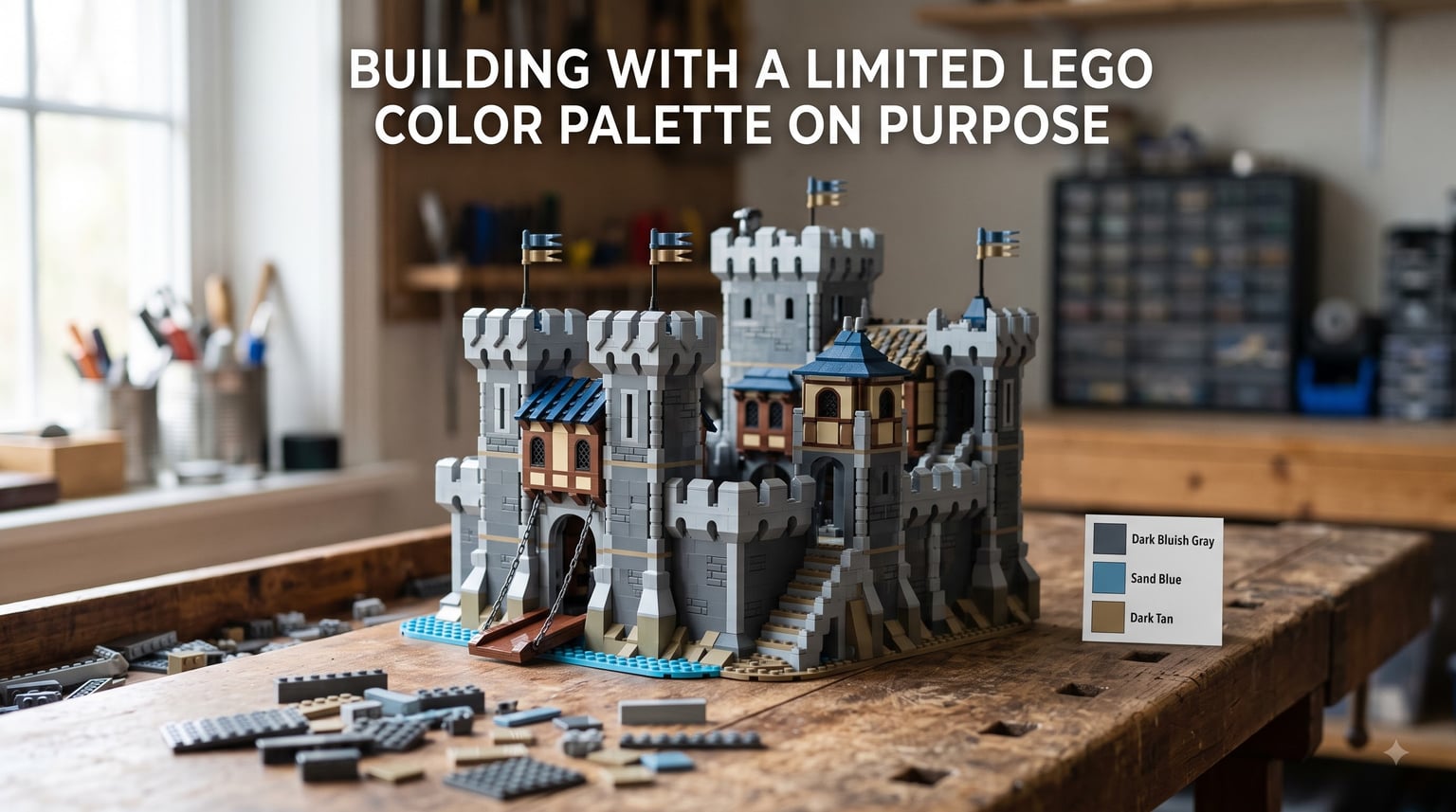
I used to think having every LEGO color in my collection was the goal. Then I spent a year building with just six colors at a time, and my MOCs got dramatically better.
Building with a limited LEGO color palette on purpose is one of the most overlooked creative techniques in the hobby. Most articles treat color restriction as something forced on builders who don’t own many pieces. I want to flip that script entirely. A small palette is a deliberate creative choice that unlocks something bigger than another shade of azure.
In this guide, I will walk you through why constrained color choices lead to stronger builds, the color theory basics that actually matter for LEGO, real combinations that work, and how professional builders on LEGO Masters use restriction as a secret weapon. By the end, you will have a clear process for picking your next intentional palette.
Table of Contents
Why Build With a Limited Color Palette on Purpose
Every artist knows the magic of creative constraint. Songwriters write better songs with three chords. Designers create stronger logos with two colors. Chefs plate more memorable dishes with fewer ingredients. LEGO building is no different.
When I limited myself to six colors for twelve months, something shifted. My builds stopped looking like accidental rainbows. They started looking like they had been designed with intent. The technical name for this is color cohesion, but the effect is simpler: everything feels like it belongs together.
The Creative Benefits of Color Constraints
Limiting your palette forces real decisions. Instead of grabbing whatever brick catches your eye, you ask: does this color earn its place? That single question changes how you build. You start thinking about texture, shape, and proportion rather than chasing novelty.
Forum builders regularly describe the same experience. On Reddit, one builder wrote that he set a self-imposed 60-color cap for a year-long project, and the discipline made every color choice feel meaningful. Another noted that using sand green and sand blue together for a forest scene felt more cohesive than picking twenty natural tones that fought each other.
There is also a psychological benefit that no competitor article talks about. When you cannot pick from 180+ LEGO colors, your mind relaxes. The choice paralysis disappears. You build more, second-guess less, and finish more MOCs.
When Restriction Becomes a Strength
The old LEGO palette from the 1950s and 60s only had about twelve colors total. Builders of that era created stunning things anyway. Limited colors forced early fans to master shape and scale instead of hiding behind color variety.
I think modern builders sometimes forget this. A glossy brochure model with forty different colors often looks generic. A small castle in dark gray, sand blue, and dark tan feels crafted. That is the power of intentional color restriction.
Color Theory Basics for LEGO Builders
You don’t need an art degree to use color theory. Three concepts cover ninety percent of what matters for LEGO building.
Hue, Saturation, and Luminance Explained
Hue is the actual color family (red, blue, green, yellow). Saturation is how intense or muted a color feels. Luminance is how light or dark it is. LEGO’s official color naming gets surprisingly specific here.
For example, “Medium Blue” and “Dark Blue” have the same hue but different luminance. “Earth Orange” and “Bright Orange” share hue but differ in saturation. When you mix a saturated color with a muted color in the same hue family, you get visual texture without breaking your palette.
How the Color Wheel Applies to LEGO
The color wheel arranges hues in a circle. Colors next to each other are analogous (blue, blue-green, green). Colors opposite each other are complementary (blue and orange, red and green). Three colors evenly spaced form a triadic scheme (red, yellow, blue).
For a limited LEGO palette, you almost always want either analogous colors (very safe) or one main color plus a complementary accent (more dramatic). Triadic schemes work for energetic builds but get tricky with only three or four colors.
LEGO Color Combinations That Actually Work
After testing dozens of palettes in our own builds and studying forum discussions, these combinations consistently deliver strong results.
Analogous Color Schemes
Pick three colors that sit next to each other on the color wheel. For a forest scene, dark green, sand green, and olive green work beautifully. For a desert, dark tan, nougat, and medium nougat blend like sand dunes.
Analogous palettes feel natural and calming. They are hard to mess up, which makes them perfect for your first intentional limited build. I built an entire medieval tavern with dark brown, reddish brown, and medium nougat, and it looked like it belonged in one scene.
Complementary Color Schemes
Choose two colors that face each other on the wheel. Blue and orange contrast strongly. Purple and yellow pop dramatically. Red and green feel like Christmas, but in moderation.
The trick with complementary palettes is using one color as the dominant and the other as an accent. If you try to balance equal amounts of blue and orange, the build starts to vibrate visually. Apply the 80/20 rule: eighty percent of your dominant color, twenty percent of its complement.
Monochrome Builds
Going all-in on a single color is the most extreme form of limitation, and it produces some of the most striking MOCs online. Mono-build challenges require you to rely entirely on shape and texture rather than color storytelling.
When we ran a single-color test with dark bluish gray, every panel gap, every slope, every stud placement suddenly mattered. It felt like building with training wheels off. The constraint was uncomfortable at first, then completely freeing.
Color Blocking Technique
Color blocking means grouping solid blocks of color rather than mixing them throughout the build. Instead of sprinkling dark gray and light gray randomly, you create one panel of dark gray beside one panel of light gray.
This is a foundational technique in LEGO composition, and it pairs perfectly with limited palettes. Color blocking with five colors looks cleaner than color blending with twenty. The blocks read as distinct design choices rather than accidents.
How to Choose Your Limited LEGO Color Palette
Picking a palette is the actual craft. Here is the process I walk through every time I plan a new MOC.
Step 1: Decide Your Mood and Theme
Ask yourself what feeling you want the build to evoke. Industrial, warm, peaceful, dramatic. The mood should drive your color choice, not the other way around.
A sci-fi cargo ship wants cool grays and a yellow accent. A cottage bakery wants warm earth tones and maybe a red pop. Writing your mood down in a single word (like “cozy” or “ominous”) gives you a filter for every color decision.
Step 2: Pick Your Core Trio
Start with three colors that match your mood. Two should be close in tone and one should provide a contrast or accent. For a calm harbor scene, I picked dark bluish gray, sand blue, and white. Three colors that immediately read as ocean and sky without any fuss.
Once your trio works, you can add one or two more colors sparingly. Six colors is usually the upper limit for a focused build. Anything beyond that and your palette stops feeling intentional.
Step 3: Test the Palette Digitally
Before building anything, mock up a small test scene in LEGO Studio or sketch it on paper with colored pencils. This sounds like extra work, but it saves hours of brick-sorted frustration later.
Forum builders repeatedly recommend the BrickLink Color Guide for verifying how LEGO colors actually photograph and pair. Screenshots and color charts can be misleading. Real builds have lighting, texture, and scale that shift how colors appear.
Step 4: Refine With Community Insight
Before locking in a palette, search the AFOL community for builds in similar themes. See what colors veterans used. Sand blue and sand green are widely loved earth tones that pair with almost anything. Medium nougat is a warmer alternative to plain tan that many builders prefer.
You are not copying anyone. You are learning which combinations have already been battle-tested by people who build every week.
Learning From LEGO History and the Original Palette
The very first LEGO bricks came in a tiny palette. Red, white, yellow, blue, green, black, and a few translucent colors. That was it. Builders in the 1950s created entire towns, trains, and castles from this restricted set, and they looked fantastic.
The 2004 introduction of “bley” (the warmer bluish gray that replaced the older yellowish gray) was a turning point. Color science in the brick world was finally catching up to art and design principles. Realistic builds suddenly looked more real.
Modern LEGO now offers over 180 colors, which is overwhelming for newcomers. Many old-school builders have told me they stayed with a handful of colors out of principle, not poverty. They preferred the discipline of a smaller palette. Their MOCs often had stronger identity because of it.
Lessons From LEGO Masters and Professional Builders
If you have watched LEGO Masters, you have seen color restraint in action. The judges consistently reward cohesion over variety. Builds that commit to a color story almost always score higher than builds that throw every available piece at the challenge.
LEGO designers like Jamie Berard (senior designer behind the Modular Buildings line) and Amie Corbett are famous for using highly restricted palettes to create architectural sets that feel elevated. Their work is a masterclass in color discipline.
Professional AFOL builders regularly cite the show as their introduction to intentional palette thinking. The takeaway is simple: every color in a strong MOC does a job. If a color does not do a job, it should be cut.
Digital Tools and Resources for Palette Planning
You do not need fancy software to plan a limited palette, but a few tools make the process faster.
BrickLink Color Guide
BrickLink’s color guide is the gold-standard reference for what LEGO colors actually look like in finished builds. Photos of real parts in real lighting beat color swatches every time.
LEGO Studio
The official LEGO Studio software lets you mock up builds digitally before committing physical bricks. If your local inventory does not have a specific color, you can hide it in the parts filter so you focus only on what you own.
To hide unavailable colors in Studio, go to the palette dropdown, right-click any color you do not have, and select “Hide.” The hidden colors disappear from your parts menu. This is the simplest way to force yourself into a limited palette for a digital test build.
Color Palette Websites
Tools like Coolors.co let you generate palette ideas outside the LEGO universe, then map those palettes to actual LEGO brick colors. It sounds indirect, but it breaks you out of color habits and helps you see combinations you would never try on your own.
Community Challenges and Single-Color Builds
One of the best ways to practice limited palette building is to join a challenge. The classic monochrome challenge forces you to use a single color, often dark gray or white. The difficulty pushes you to grow fast.
Building communities on Reddit, Flickr, and Eurobricks regularly run palette restriction events. Some limit you to three colors, some to earth tones only, and some to specific themes like “all blues and greens.” Participating in these challenges teaches you more about color than months of casual building.
If you are not ready to commit to a public challenge, try a private one. Give yourself a single-color weekend and build anything you want. Track how different your result feels from a normal build. I bet the difference will surprise you.
Frequently Asked Questions
Why should I limit my LEGO color palette on purpose?
Limiting your palette forces meaningful choices, eliminates decision paralysis, and creates stronger visual cohesion. Builders who restrict color tend to focus more on shape, proportion, and texture, which often leads to more striking MOCs than builds that use every available color.
What colors go together best in LEGO builds?
Sand blue pairs with dark bluish gray for cool, realistic scenes. Dark tan, nougat, and reddish brown create warm, earthy palettes. For dramatic contrast, try medium blue with bright orange or dark red with bright yellow. Analogous combinations (colors next to each other on the color wheel) are the safest starting point.
What is the 5/2 rule in LEGO?
The 5/2 rule is a community guideline suggesting builders use no more than 5 colors in a build, with 2 of those colors acting as accents. The rule keeps palettes focused and prevents the chaotic rainbow look that can come from using too many colors at once.
What is the rarest color of LEGO?
Among modern LEGO colors, lavender, light violet, and certain shades of pink are among the rarest in production. Historically, colors like maersk blue, medium violet, and old gray (pre-2004) are highly sought after by collectors due to limited production runs or discontinuations.
How do you hide unavailable colors in LEGO Studio?
Open LEGO Studio, load any model or part, then click the palette dropdown at the bottom of the screen. Right-click any color you do not own and select Hide. Hidden colors disappear from your parts menu, letting you plan builds around only the colors in your physical collection.
Start Your First Intentional Palette Today
Building with a limited LEGO color palette on purpose is not about doing less. It is about choosing more carefully. The constraint unlocks creativity you did not know you had, and your builds will look more cohesive from the very first brick.
Pick three colors tonight. Match them to a mood. Build something small. See for yourself how strong a simple palette can be when it is chosen on purpose.