
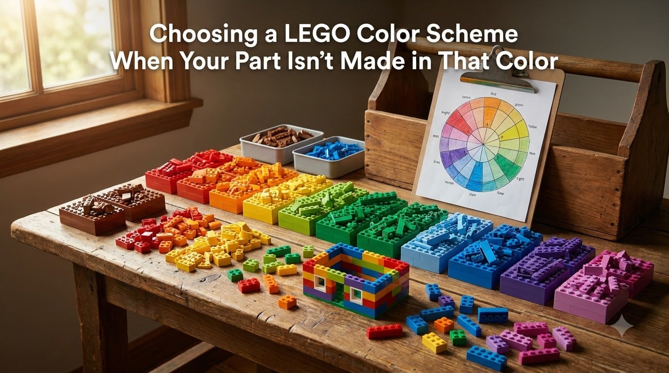
You found the perfect part for your MOC. You picture it in bright red, but LEGO only makes that piece in white, black, and bluish gray. This is the single most common frustration I hear from builders, and it is the exact problem this guide solves.
Choosing a LEGO color scheme when your part isn’t made in that color is a normal part of the hobby, not a roadblock. With around 15,000 active elements and only 40-ish standard colors, the math simply does not work out to every part in every shade. I have rebuilt dozens of custom creations because a single brick was missing the color I needed, and I have learned that a few color theory tricks and the right search tools turn dead ends into new design ideas.
In this 2026 guide, I will walk you through how LEGO’s palette works, the color theory every builder should know, the famous 5/2 rule, a step-by-step BrickLink workflow, and the workarounds I use when no brick in any color will do the job.
Table of Contents
Why LEGO Doesn’t Make Every Part in Every Color
LEGO’s color system is smaller than most people expect. The current LEGO color palette contains roughly 40 solid colors, plus a handful of transparent and effect shades. With thousands of unique parts being molded, LEGO picks which colors make economic sense for each element.
A 1×1 round plate might exist in 25 colors, while a large Technic panel exists in only 4 or 5. Specialty parts often appear only in black, white, or bluish gray because those are the colors used internally for hidden structural pieces. This is why your favorite wedge plate shows up in every vibrant shade except the one you need.
Understanding LEGO’s Standard Color Palette
LEGO groups its solid colors into a few working families: Bright colors (reds, blues, yellows, greens), Earth colors (browns, tans, oranges), Sand colors (sand blue, sand green, sand red), and a wide range of grays from Light Bluish Gray to Black. Each family serves a different visual purpose in a build.
Bright colors draw the eye and are used sparingly for accents. Earth and Sand colors recede visually and work well for realistic buildings and natural landscapes. Grays form the structural backbone of most sets because they photograph well, match real-world concrete, and stay out of the way of brighter accents.
The 2005 Color Shift and Why It Matters
If you have ever wondered why old LEGO gray looks slightly greenish next to new LEGO gray, you are not imagining it. In 2005, LEGO retired “Light Gray” and “Dark Gray” in favor of “Light Bluish Gray” and “Dark Bluish Gray.” The new shades are warmer and slightly bluer, which is why old sets mixed with new ones can look mismatched.
This matters for color planning because community builders often refer to the old grays as “Lego Gray” and the new ones as “Bley” (a portmanteau of blue and gray). Knowing which gray you actually own saves you from accidentally buying the wrong one for a color-sensitive build.
Naming Confusion: LEGO vs BrickLink Colors
The names on LEGO’s official site do not always match what you will see on BrickLink. LEGO officially uses names like “Medium Nougat,” “Dark Turquoise,” and “Sand Blue.” BrickLink uses its own internal names that occasionally differ, especially for legacy colors that LEGO has retired but BrickLink still tracks for collectors.
Always cross-reference using the BrickLink color ID number when you are searching for a specific shade. It is the only universal way to be sure you are getting the exact color you planned, regardless of which name is on the listing.
Color Theory Basics for LEGO Builders
Color theory is the toolkit that lets you pick a great substitute when your first choice is unavailable. You do not need an art degree. You need to understand the relationships between colors on a wheel and how brightness, dullness, and warmth change the feel of a build.
The Color Wheel and Hue, Saturation, Luminance
Every color has three measurable properties. Hue is the actual color: red, blue, green. Saturation is how vivid or dull it is. Luminance is how light or dark it is. LEGO’s designers work in this HSL color space constantly when they decide whether a new shade belongs in the palette.
When you substitute a color, match the saturation and luminance first, then worry about hue. A muted olive green will blend into a castle wall much better than a neon lime green, even if the lime green is technically closer in hue. This is the single biggest trick I share with new builders.
Complementary Colors for Bold Contrast
Complementary colors sit directly across from each other on the color wheel. Red and green, blue and orange, yellow and purple. They create maximum contrast, which is why they are perfect for highlighting one element against another.
If your bright red hero piece is unavailable, consider a complementary green or a near-complementary earth orange instead. The eye will read the contrast the same way, and you may actually prefer the look. Use complementary pairs when you want a single pop of color to dominate a build.
Analogous Colors for Cohesive Builds
Analogous colors sit next to each other on the wheel: blue, blue-green, and green, for example. They create a calm, unified look because the eye reads them as part of the same family. Most nature photography uses analogous palettes, which is why analogous LEGO schemes feel realistic and grounded.
When the exact part is not available, picking the color next to your original choice on the wheel almost always works. A piece that would have been bright orange might look perfectly at home in a slightly redder or slightly yellower shade. The whole build will read as warm either way.
Triadic Schemes for Vibrant MOCs
Triadic color schemes use three colors spaced evenly around the wheel: red, yellow, and blue, or orange, green, and purple. They are lively, balanced, and feel playful, which makes them perfect for carnival, fantasy, or children’s theme MOCs.
Triadic palettes forgive color substitutions more than any other scheme. If you cannot get the exact red, almost any warm hue will slot in cleanly because the eye expects three distinct families rather than one precise shade.
The 5/2 Rule in LEGO Color Planning
The 5/2 rule is a guideline many experienced builders use when planning a color scheme. The short version: in any single LEGO build, try to use an odd number of major colors, with one or two accent colors standing out from the main palette.
What the 5/2 Rule Actually Means
The “5” refers to roughly five dominant colors that make up the bulk of the build. The “2” refers to two smaller accent colors used sparingly for highlights, eyes, logos, or other small details. The rule is flexible. Some builders use 3 main colors and 1 accent, others use 7 main colors and 2 accents.
The key idea is balance. Too few colors and the build looks flat. Too many colors and the eye has nowhere to land. The 5/2 framework gives you a starting point that almost always produces a clean, readable result.
Why Odd Numbers of Colors Work Better
Designers prefer odd-numbered groupings because the eye cannot pair them up automatically. Two main colors create a binary split. Three, five, or seven main colors create a hierarchy with one dominant and several supporting shades.
When you are forced to substitute a part color, the 5/2 structure absorbs the change gracefully. The new color slots into one of the five main slots, and the overall composition still feels intentional rather than chaotic.
Step-by-Step: Finding LEGO Color Alternatives on BrickLink
BrickLink is the single most powerful tool for solving the “part not available in this color” problem. It catalogs every part LEGO has ever produced, in every color it has ever been produced in, and lets you filter by Element ID, category, and availability. Here is the exact workflow I use.
Step 1: Find the Right Element ID
Every LEGO part has a unique Element ID, a number like 3024 for a 1×1 round plate or 2431 for a 2×3 tile. You can find it by searching the part name in BrickLink’s catalog, by scanning a part with the BrickLink Stud.io software, or by looking it up on LEGO’s official Pick a Brick site.
Write down the Element ID before you search by color. Searching by name alone pulls up dozens of similar parts and wastes time.
Step 2: Search by Part, Then Filter by Color
Type the Element ID into BrickLink’s main search bar. You will land on a page showing every color the part has been produced in, with current availability counts from sellers around the world. This single view answers the core question “does LEGO even make this in my color?” instantly.
Sort the results by “Color” rather than by availability to see the full visual range. Hover over each color chip to read the official LEGO name, the BrickLink ID, and the year the part first appeared in that color.
Step 3: Compare Available Colors Side by Side
Open the LEGO color chart and compare the colors that do exist against the color you originally wanted. Use HSL thinking: which available color is closest in saturation and luminance, even if the hue is a bit off?
If two colors look similar on screen but one has noticeably more inventory, the more-available option is usually the safer buy because you can complete a build without sourcing from five different sellers.
Step 4: Use Pick a Brick for Official LEGO Stock
LEGO’s Pick a Brick service is the place to go when you want current production colors direct from the source. The selection is narrower than BrickLink’s archive, but every piece you find there is in current production, meaning replacement parts will match for years.
Paste your Element ID into Pick a Brick, and the site will show you only the colors in which LEGO is actively producing that part today. This is the best filter for builders planning a long-running project who want color consistency over time.
Shade Matching: When an Exact Color Doesn’t Exist
Even with BrickLink in hand, you will sometimes find that no available color is a perfect match. That is when shade-matching techniques come in. These tricks let you pick the closest possible alternative without the build looking “off.”
Saturation and Luminance Matching
Two colors can have very different hues but still feel like they belong together if their saturation and luminance are matched. A muted teal will sit next to a muted olive and feel like family, even though they are far apart on the wheel.
When in doubt, match the dullness. A bright neon yellow next to a dusty mustard will always look wrong, no matter how clever the rest of your palette is.
Color Blocking to Mask Slight Differences
Color blocking means grouping many bricks of the same color together so the eye reads them as one mass. When you color-block, tiny shade differences disappear because the brain averages the whole region into one color.
This is exactly how LEGO designers handle the gray-bley mismatch issue. They cluster all the light bluish gray in one wall and all the dark bluish gray in another, so the slight hue difference between elements is invisible. You can use the same trick when mixing substitute shades.
Using Detailing Colors to Bridge Gaps
Small “detail” colors like Medium Nougat, Dark Tan, or Olive Green are designed to bridge visual gaps between larger color families. Sprinkling them between your main and substitute colors softens the transition and makes an imperfect match feel intentional.
A single Olive Green stripe between a green wall and a tan wall reads as deliberate decoration. The eye accepts it as design, not as a compromise.
Smart Workarounds When No Color Works
Sometimes no part, in any color, will solve the problem. Maybe the geometry is wrong, or the part only exists in three colors and none of them fit. These are the workarounds I reach for in those situations.
Substitute a Different Part
The single best trick is to find a different part that fills the same visual role but exists in your color. A 1×2 brick and a 1×2 plate are not interchangeable structurally, but in many builds they look identical.
Search BrickLink by visual role rather than by exact part name. Try “1×2” or “2×2” and browse the resulting parts until you find one that comes in the color you want.
Sticker and Decal Solutions
Stickers, printed tiles, and custom decals can change the apparent color of a part without changing its actual plastic. A black brick with a bright yellow sticker reads as yellow for most viewing distances.
This is a common technique in MOC photography and display builds where color accuracy matters more than structural perfection. Just remember that stickers wear over time and decals can peel, so plan for periodic replacement on heavily handled pieces.
Why You Should NOT Spray Paint LEGO
Spray painting LEGO bricks is legal in most countries, but it is a bad idea for several practical reasons. Paint chips off under the stress of being clicked together and pulled apart. Paint ruins the clutch power of the brick. Paint changes the dimensions slightly, which throws off SNOT techniques and tile alignment.
If you need a color LEGO does not make, buy from a custom-painted third-party vendor who specializes in it, or rethink the part choice entirely. Your build will last longer and look better.
Organization Tips for Choosing Color Schemes
Good color planning depends on knowing what you actually own. A well-organized collection lets you see at a glance which colors are realistic for a new build and which colors you will need to source from outside.
Should You Sort LEGO by Color or Piece?
For color planning purposes, sort at least one section of your collection by color. A single drawer of mixed parts sorted by hue becomes a reference palette. You can pull it out, compare it to your planned scheme, and immediately see whether you have enough dark grays, or whether you are missing warm earth tones.
Most experienced builders use a hybrid system: large common parts sorted by type for fast building, smaller specialty parts sorted by color for palette planning. Both views serve different purposes and both are worth the time to set up.
Building a Reference Palette from Your Collection
Take a photo of your color-sorted drawer once a year. The photo becomes your personal color chart, showing what you actually have available. Compare this chart to your planned MOC palette before you start, and you will save hours of mid-build frustration.
Update the chart whenever you add new colors to the collection. Over time, this photo becomes the most useful planning tool you own.
Frequently Asked Questions
What is the 5/2 rule in LEGO?
The 5/2 rule in LEGO is a color-planning guideline suggesting you use around five main colors for the bulk of a build, plus two smaller accent colors for highlights and details. The odd number of main colors creates a visual hierarchy the eye finds pleasing, and the two accents give you room for pops of contrast without overwhelming the build. Most builders adapt the numbers (3 main plus 1 accent, or 7 main plus 2 accents) depending on the build size.
What is the rarest color of LEGO?
The rarest modern LEGO color is generally considered to be Magenta (a bright pink-purple), which was produced only briefly in a few sets during the late 1990s and early 2000s. Among current production colors, Medium Lilac and Dark Turquoise appear in very few parts. For collectors, the truly rarest shades are the limited-run promotional colors and the unreleased prototype shades that never made it to retail.
Should you sort Legos by color or piece?
Sort your LEGO collection by both color and piece, using a hybrid system. Sort large common parts (bricks, plates, tiles) by piece type for fast building, and sort smaller specialty parts (wedges, panels, minifigure accessories) by color for palette planning. A dedicated color-sorted section doubles as a reference chart when you are planning new builds and need to see what shades you actually own.
Is it illegal to spray paint LEGO?
It is not illegal to spray paint LEGO in most countries. LEGO bricks are yours to modify once purchased. However, painting LEGO is widely discouraged in the builder community because paint chips off under normal building stress, paint interferes with the clutch power that makes bricks grip, and paint changes the brick dimensions slightly, which causes alignment problems in detailed builds. Custom-painted third-party parts are a better alternative when you need a non-standard color.
Final Thoughts on LEGO Color Substitution
The day you cannot find a part in your desired color is the day LEGO building gets interesting. Color theory, the 5/2 rule, and a working knowledge of BrickLink turn that frustration into a design opportunity. Substitute parts often look better than the originals because you had to think harder about the palette.
Start by checking BrickLink for every part on your shopping list. Apply the 5/2 rule to your color scheme before you commit to a design. Match saturation and luminance before matching hue, and remember that color blocking hides minor shade differences. With these tools in 2026, you will never be stuck because of a single unavailable color again.